
Product Analytics
Joined a 10k-row event log to a product catalog, audited product mapping, and surfaced persistent firmware and line–supplier concentrations in an interactive analytics dashboard.
- Organization
- Independent
- Timeline
- 2026
- My role
- End-to-end product analytics — data validation, SQL modeling, signal investigation, recommendations, and dashboard delivery.
The problem
Product teams often have an event log and a separate product catalog. Before trusting product-level rollups, the sources need validation — and real operational signals have to be separated from mapping noise.
Why it matters
Product analytics only help if joins are trustworthy and concentrations are persistent. A wrong product map can invent “hot” SKUs; a real line–supplier or firmware pattern can prioritize the next investigation.
Data & inputs
- Event / complaint log — 10,000 rows × 12 columns.
- Product catalog — 20 products joined on Device_ID = Product_ID.
- Operational fields including issue type, firmware version, manufacturing line, supplier, shift, and time.
Approach
Validated grain and join keys first, built a reusable SQL view over event + product fields, audited semantic product/category mapping, then concentrated on subgroup signals that stayed elevated across months and device mix. Packaged findings into an interactive HTML dashboard.
- 01SourcesEvent log + product catalog
- 02ValidateGrain, IDs, left-join integrity
- 03SQL modelReusable event×product view
- 04Signal huntFirmware · line×supplier · mapping audit
- 05DashboardPlotly product analytics HTML
Interactive product analytics dashboard
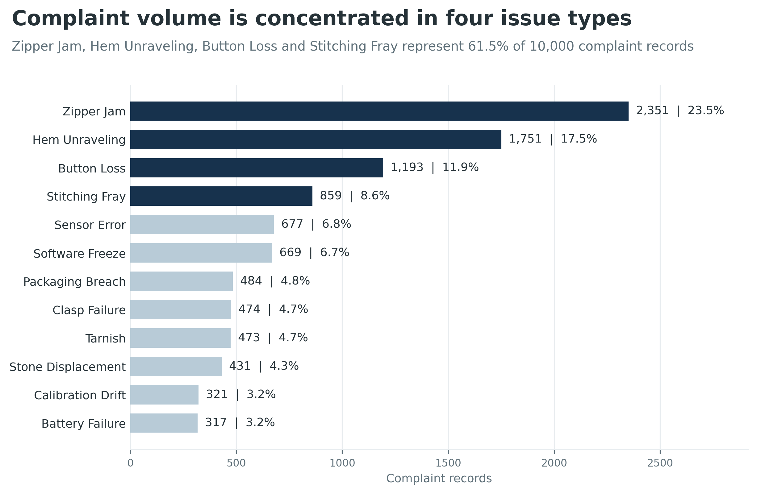
Interactive walkthrough of the complaint mix, mapping audit, and operational signals. Open fullscreen if the embed feels tight.
My contribution
- Confirmed one-to-one product lookup (10k rows in, 10k out, zero unmatched events).
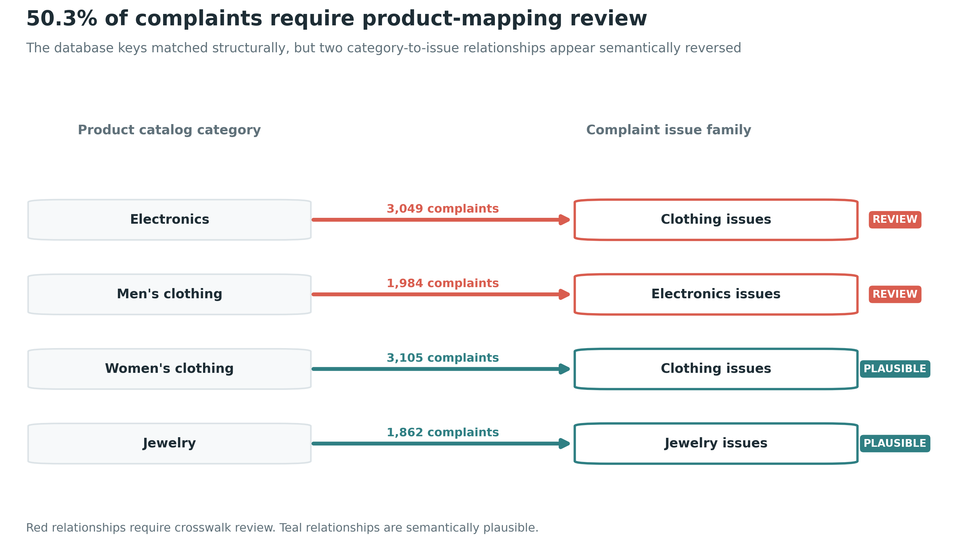
- Flagged a semantic product/category mismatch affecting 5,033 events (50.33%) so product rollups stayed provisional.
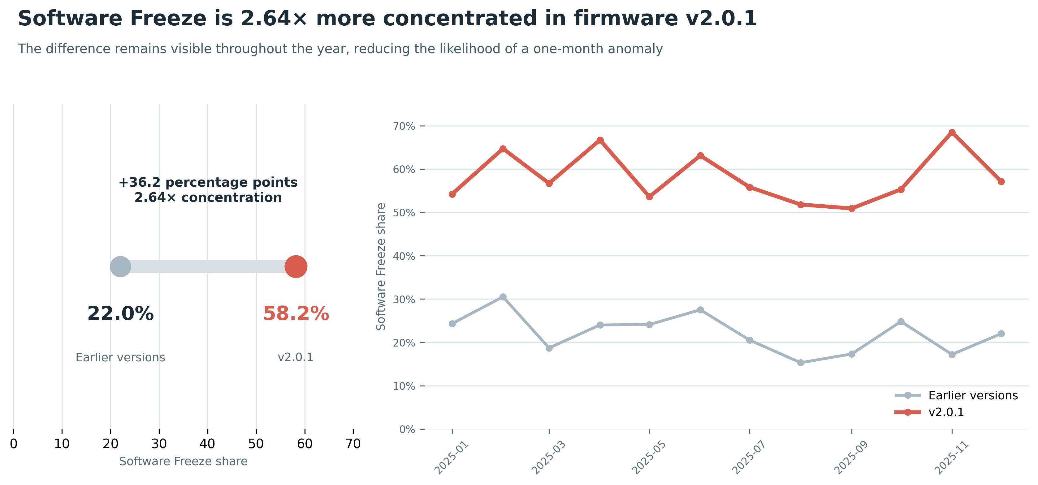
- Quantified Software Freeze concentration on firmware v2.0.1 (58.2% vs 22.0% earlier — 2.64×) across the full year.
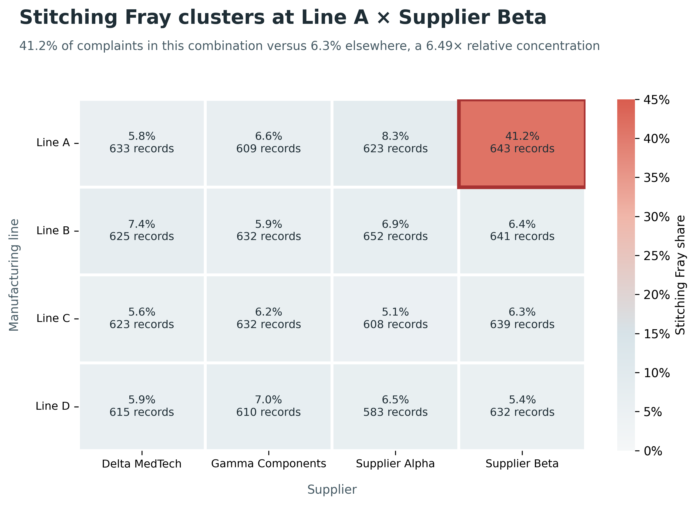
- Isolated Stitching Fray on Line A + Supplier Beta (41.2% vs 6.3% elsewhere — 6.49×), persistent by month and within Device IDs.
- Shipped an interactive product analytics dashboard for stakeholder review.
Technical details
- Python + Pandas for profiling and Plotly figure generation; SQLite for the reusable analysis model.
- Literal firmware label N/A treated as not-applicable (excluded from version comparisons), not as missing data.
- Concentration and effect-size framing for operational signals; lower-priority factors deprioritized after checks.
- Self-contained review HTML for walkthroughs without a separate BI tool.
Challenges & decisions
- Product IDs join cleanly, but semantic product/category labels disagree for half the file — structural join ≠ trustworthy mapping.
- Common issue types can look “hot” globally; signals only matter when concentrated in a specific firmware or line–supplier cell and persistent over time.
- Event data supports investigation prioritization, not causal proof.
Results
- Mapping: reconcile product/category labels before product-level reporting (≈50% of events affected).
- Firmware: review v2.0.1 — Software Freeze 2.64× more concentrated than earlier versions, year-long.
- Manufacturing: process review for Line A + Supplier Beta — Stitching Fray 6.49× vs other combinations.
- Deliverable: interactive product analytics dashboard for end-to-end findings review.
Limitations
What I learned
Validate the join and the semantics before celebrating a dashboard. Useful product analytics separate mapping debt from persistent operational concentrations.